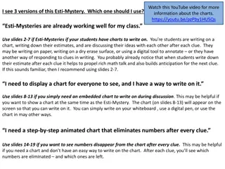
Chart Makeovers for Compelling Data Visualization
Discover how to enhance your data presentations with chart makeovers by David Goldstein, President of Mekko Graphics. Transform simple charts into impactful visualizations through segmentation, CAGRs, highlight colors, axis breaks, and more. Learn how to effectively compare revenue trends, bar charts, P&L trends, smartphone market data, and cascading changes for clearer insights.

Uploaded on | 2 Views
Download Presentation

Please find below an Image/Link to download the presentation.
The content on the website is provided AS IS for your information and personal use only. It may not be sold, licensed, or shared on other websites without obtaining consent from the author. If you encounter any issues during the download, it is possible that the publisher has removed the file from their server.
You are allowed to download the files provided on this website for personal or commercial use, subject to the condition that they are used lawfully. All files are the property of their respective owners.
The content on the website is provided AS IS for your information and personal use only. It may not be sold, licensed, or shared on other websites without obtaining consent from the author.
E N D
Presentation Transcript
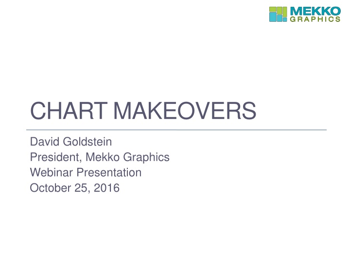
CHART MAKEOVERS David Goldstein President, Mekko Graphics Webinar Presentation October 25, 2016
Before: Revenue Trend This simple chart tracks corporate revenue over time.
After: Revenue Trend Adding segments, CAGRs and a highlight color makes the chart more compelling.
Before: Simple Bar Comparison Our fund has outperformed the benchmark in 9 of the past 11 years.
After: Simple Bar Comparison Adding an axis break and a data row helps make the message more clear.
Before: P&L Trends It is difficult to compare financial trends over time using a cluster bar chart.
After: P&L Trends A stacked bar chart with a CAGR column makes this comparison easier.
Before: Smartphone Bar Chart While the total market grew only 2.5%, the top 5 smartphone makers shipped between 23 and 56% more units to China.
After: Smartphone Bar Mekko A bar mekko chart makes it clear that the market is fragmented but the smaller competitors are declining.
Before: Horizontal Change Cascade Unit volume will increase 50% over the lifecycle of the deal.
After: Change Cascade Using an axis break helps to highlight components of change and the bar comparison line makes the message more clear.
Before: Wall Street Journal Table Harvard s fund performance is lagging, but it has the largest endowment.
After: Bar Mekko Chart Combining these variables into a bar mekko chart allows you to see both the relative performance and the size of the fund in a single chart.
Before: NYT Grid Can you tell what percent of the population voted for Clinton? Source: New York Times
After: Marimekko Of the 324 million Americans, only 30 million voted for either Donald Trump or Hillary Clinton in the primaries.
Resources Mekko Graphics Chart Gallery provides examples of many uses of our charts: http://www.mekkographics.com/resources/charts-by-type/ Chart of the Week Blog provides topical examples of Mekko Graphics charts: http://www.mekkographics.com/resources/blog/ Videos show how to produce different types of charts and how to use different product features: http://www.mekkographics.com/resources/get-started/videos/ Follow Mekko Graphics on LinkedIn, Facebook and Twitter and connect with me on LinkedIn For other questions or product feedback, email me at david@mekkographics.com