Learn how to create engaging charts with the best-of-the-best from Chart of the Week series. Explore diverse topics like college conferences, beer consumption, NFL spending, pet budgets, moviegoers' demographics, government missions, and travel destinations. Enhance your data visualization skills with these insightful examples and tutorials.
Please find below an Image/Link to download the presentation.
The content on the website is provided AS IS for your information and personal use only. It may not be sold, licensed, or shared on other websites without obtaining consent from the author. If you encounter any issues during the download, it is possible that the publisher has removed the file from their server.
You are allowed to download the files provided on this website for personal or commercial use, subject to the condition that they are used lawfully. All files are the property of their respective owners.
The content on the website is provided AS IS for your information and personal use only. It may not be sold, licensed, or shared on other websites without obtaining consent from the author.
E N D
Presentation Transcript
BEST OF THE BEST FROM CHART OF THE WEEK How to create some of the most popular charts from the series.
Most Valuable College Conferences Led by its TV revenue, the SEC outperforms its peers.TV and bowl appearances are also big revenue generators for the next 4 conferences. Source: Forbes Learn how to make this chart
European Beer Consumption While consumption is flat or declining in traditional beer producers like Germany, U.K., Belgium and the Czech Republic, it is growing in wine producers like Spain, Italy and France. Source: The Brewers of Europe Learn how to make this chart
NFL Team Spending by Position On average teams spend slightly more on offensive than defensive players. The largest outlays are for quarterbacks and the smallest for long snappers. Source: Sportrac Learn how to make this chart
Pet Spending Dashboard Americans spent over $63B on their pets. Dog owners outspend cat owners by over $500 per year. Source: American Pet Products Association Learn how to make this chart
American Moviegoers by Age and Ethnicity Moviegoers are typically younger and more likely to be non-Caucasian. 18-24 year-olds go to movies almost 3x more than those 60+. Source: MPAA Theatrical Market Statistics 2016 Learn how to make this chart
US Government Spending by Mission Federal, state and local governments spent $5.4 trillion in 2014. Spending is categorized by the 4 government missions found in the US Constitution. Source: USAFacts Learn how to make this chart
Global Top 20 Travel Destination Cities Asian cities experienced higher growth than European ones. Dubai and New York had the highest spend per visit. Source: Global Destinations Cities Index Learn how to make this chart
Unicorn Exits in 2015 and 2016 While tech unicorns get most of the press, healthcare accounted for almost 1/3 of the $97B exits over the last two years. Learn how to make this chart Source: CB Insights
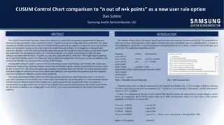
Tech Giant Quarterly Income Comparison Even though Apple had an earnings miss, its revenue and profits are still far greater than the other large tech firms. Source: Company websites Learn how to make this chart
Resources Learn Ask Connect LinkedIn graphic.PNG MekkoGraphics.com Mekko Graphics Toolbar How-To Videos Chart Gallery Presentations Mastering Chart Selection Strategy Consultants Toolkit Chart of the Week Build Your CQ Blog Twitter graphic.PNG